Altair 2.0 Showcase
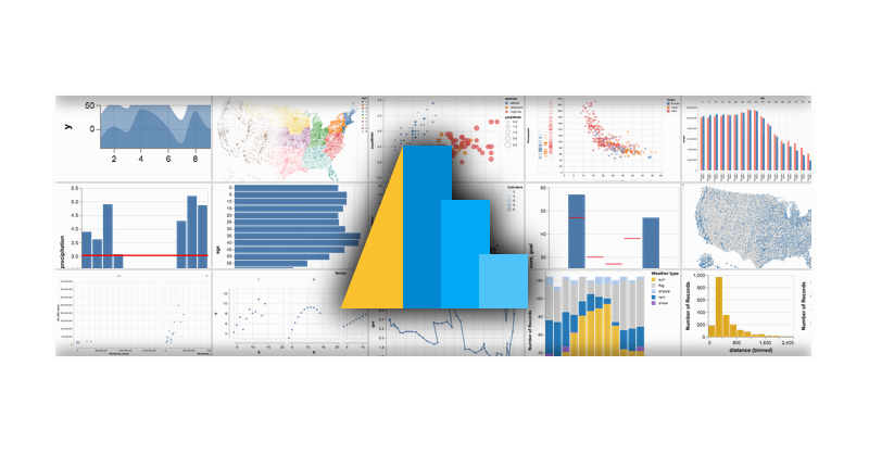 When trying to explain Altair to colleagues I find it’s easier to show than tell. I have grabbed a
few highlights from the example gallery as a
quick reference.
When trying to explain Altair to colleagues I find it’s easier to show than tell. I have grabbed a
few highlights from the example gallery as a
quick reference.
Note: All examples link to the source code.
Basic Charts
Multivariate
Geographic
Interactive
Dot Dash Plot: Click and drag on the scatter plot to highlight a region. The selection can be dragged as well.
US Population Over Time: Sliders allow for selections to be varied
Seattle Weather Interactive: Click and drag on the scatter plot for a filtered histogram. Click on the histogram bars for a filtered scatter plot. Shift-Click for mulitple bars.